Drawing 3: Tomb Raiding

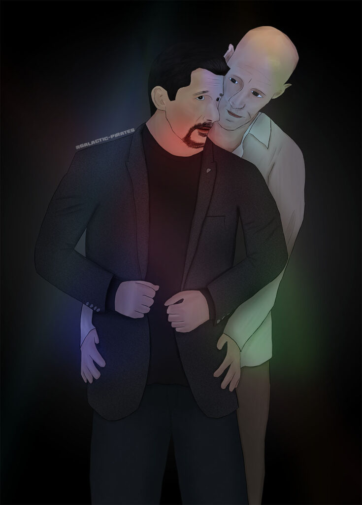
Third month running! This is good, I’m sticking to my promise. This month I drew Helen and Nikola (from Sanctuary) having supernatural shenanigans as they excavated Tut’s tomb in the 1920’s.

I said in my last drawing that I really thought about light sources but had a reference for the room. With this I didn’t have much of a reference at all for the background, so a lot of it was guesswork. However, I tried super hard with the lighting. That was my primary focus really.

You can probably see the biggest issue immediately – styling. The abnormal doesn’t match the shading on Helen and Nikola. The abnormal scorpion came out more comic book like (which I was going for) but Helen and Nikola didn’t quite so much. Especially their faces I think are much too overworked – far too soft on the shading. Helen’s determined expression didn’t come out very well and I didn’t achieve a very good likeness either. I did better with Nikola because his vamp face is so distinctive, plus men are generally easier for some reason.

Another problem is I put a texture on the background as a cheat really, trying to make it more stone-like but then again it doesn’t match the rest of the picture. I am pleased with the fire. I followed a tutorial and that came out well. The posing isn’t bad either. Helen’s gun isn’t pointed in exactly the right spot but it was tricky to line up.

With the hair this time I tried for more of a “comic book style” rather than the technique I’ve been using for the past few drawings. I need to work on that some more but I think that has promise for making for a “unity of style” which is what I really need to focus on next.

I haven’t picked my April project yet, I’ll need to think about it. I have until the 1st to decide!

image

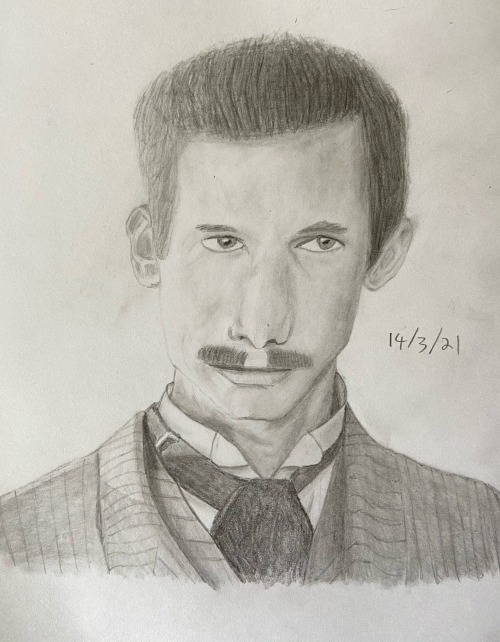
I have never posted my Sketch a Day on here before but the prompt today was “innovate”. So I drew Nikola Tesla from Sanctuary because genius inventor. Figured I would share as I think it came out half ok.

Drawing 2: The Proposal

Better late than never! I was supposed to finish this for the 14th but I didn’t. I had the first half of the gift (the gifset) ready to post and so I didn’t screw up the exchange. Plus I still finished the drawing within the month so I’m going to take that as a win.

I swore when I was working on this that I was never doing a full room again. It took forever. However, I guess if I do eventually get into drawing comics how I’d like, then I’ll need to get used to drawing backgrounds better and faster.

With this I really tried to think about the lighting sources. I confess I used a reference for the room but I had to adapt it as it was decorated for christmas and had four other characters in it. So I had a leg up with working out the lighting on the background at least. I got lucky with the reference for the kiss as both characters had kissed someone in the show (but sadly not each other). So I made a manip of them kissing and then used that as my reference.

Shading is still hard for me. I tried to be less tentative with the full faces on the kiss and use bolder shading colours. It’s a scary thing. The more I look at it, the more I’m not happy with it, but have to draw a line at some point. The firm deadline for finishing was today. I’ll hopefully learn more from doing more drawings, than I would endlessly fiddling with this one. Plus fiddling for ages makes me totally sick of what I’m doing. Best just to move on.

One thing I do want to praise myself on, and I think I’ve said this before so I’m sorry, is that I do hair so much better these days. Looking back at some of my older drawings and the hair is embarrassing. I can’t believe I actually posted those on the internet! I did one of them for an exchange and I just want to die thinking that, poor person getting that as a gift /hides.

I still haven’t picked my March project. I’ll need to declare it tomorrow when I post my goals for March in my WriYe progress thread, so I still have a little time to think about it.

Drawing 1: At the Club

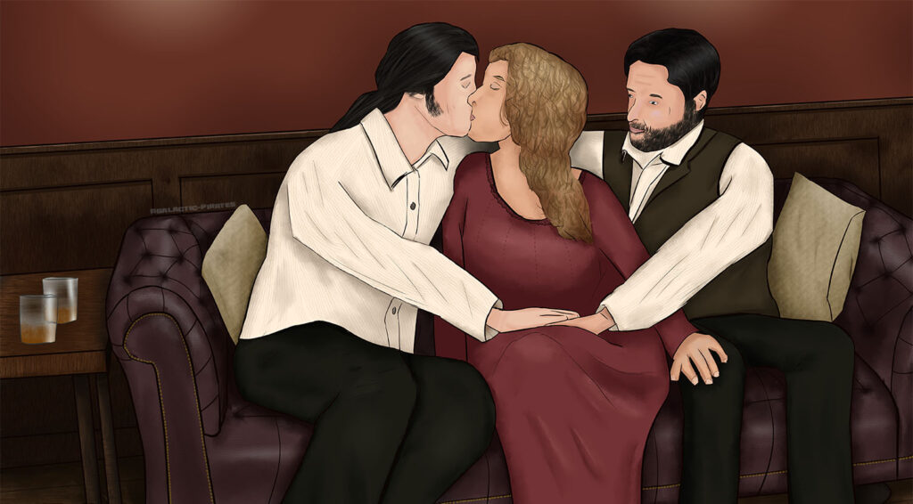
Alright! Already doing better than last year because I did in fact do a drawing in January and this is it. It’s an illustration of James Watson and John Druitt from Sanctuary, at a dance club, which pairs with my fanfic James Watson and the Curious Case of the Jarnul.

I tried to add some lighting effects to simulate strobe lighting for the club, not too sure how successful that was. I did better with likeness here because I cheated and managed to find some references of the heads in those positions. That isn’t always possible which is why likeness is a bit hit and miss and I really need to work on it. I don’t want to be so reliant on exact references, as I want to be able to do whatever pose I like.

Speaking of pose this was a tricky one. I wanted it to look like they were kinda dancing together (as I’d described in my fic) but google would not kick back two men in this kind of pose. I’m not at all confident I got the proportions right and John’s hands look a little weird. I made a reference for those myself from a selfie but as I’m only one person, I couldn’t obviously do the actual pose so it was a guess as to how the hands would be.

I think I did the skin blending slightly better than the last drawing but ehhh I’m not sure. Their noses certainly don’t look very good and I have epic failed on facial expression again. This is a much simpler drawing as there’s no background. I think there is still a narrative to it which gives it a bit of energy but expressions would have made it better. I really need to work on those.

February’s project is going to be Bering and Wells and I have a deadline of the 14th for that (the Bering and Wells exchange) so I really need to crack on.

Drawing 0: Christmas 1887

About this time last year I did a post – Drawing 0: Pirates – because it was my intention to draw every month in 2020. Alas like almost everything that plan went down the drain. To be honest my 2021 goals are basically “same as 2020 but I really, really mean it this time!”

This was an illustration of a christmas flashback scene in my Sanctuary fanfic Our Darkest Hour. John/James/Helen ship obviously. Now there’s quite a few things that I’m not happy with. For a start I still need to work on likeness, and skin shading and facial expression. Lighting sources/appropriate shading for the lighting very much too.

BUT

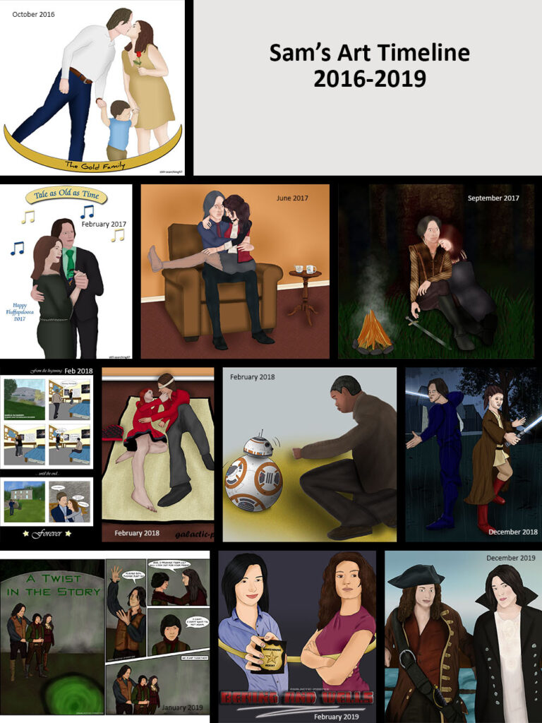
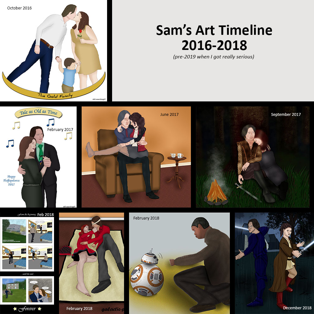
This is my “art timeline” over the past few years. I know it’s hard to see small but for the most part there has been an improvement. I’ve definitely got better at doing hair! In some of the older drawings I can pick out things that I think I did better. I’m particularly pleased with the belt sash thing Myka’s wearing in the pirates drawing for example, and I think I did the clothing on Jedi!Belle pretty well.

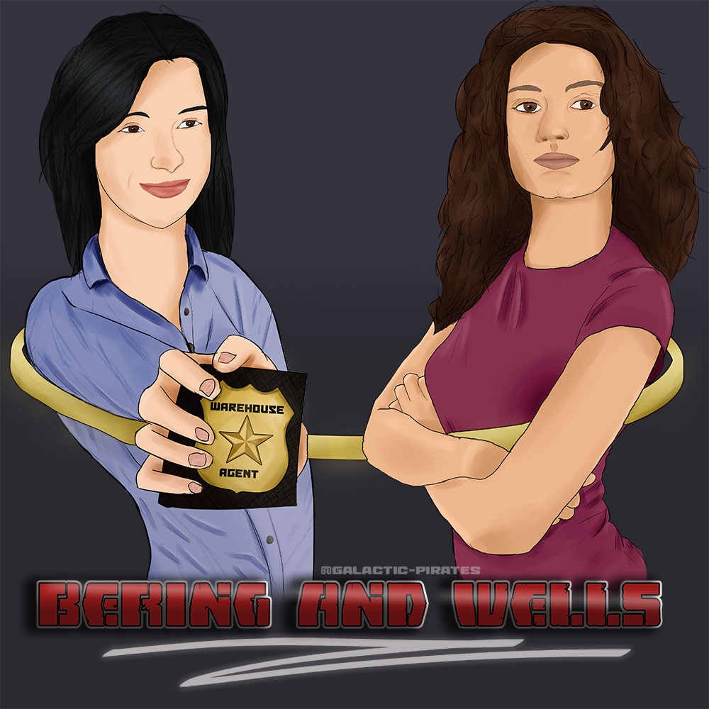
Now likeness is a tricky one because yes the two Bering and Wells drawings look a lot more like Bering and Wells, than the above Sanctuary drawing does of John, James and Helen. BUT that likeness was achieved by finding and copying an exact reference which meant I was limited on pose. The biggest leap forward with this Sanctuary drawing was in developing the pose.

The 2016 and first 2017 drawing were straight tracings over a reference I found on google. The other two 2017 drawings, the 2018 drawings and the first 2019 drawing were straight referenced from 3D modelling poses. I think I used 3 different programs in that time. The two Bering and Wells drawings were just done from photo references. Again very specific, no deviation. I could only do what I managed to find.

With this Sanctuary drawing I had a picture in my head that I wanted to bring to life. I tried to do a 3D model reference and gave up pretty quickly. Instead I found some references that were close (a starting point), and then I found more references and I even took some selfie photos of myself for arm positioning and stuff. It was all very hacked together. I’m pretty pleased with it to be honest.

With the last drawing I did (the Pirates one) my primary criticism was the lack of narrative. It was basically just a portrait, there was no action, which I think added to the lifeless/emotionless feel of the piece. That isn’t a problem with the Sanctuary drawing, it’s a much truer illustration. However, the trade-off with drawing more from my imagination, is I don’t have such specific references – which has hurt capturing the likeness. Same with clothing folds and the like but I very much believe though that it’s a step forward.

I have January’s project in mind already – an illustration of John and James dancing at the club from the fic I’m currently writing. Cross fingers that by this time next year I’ll have at least 12 new drawings for an art timeline, and hopefully showing considerable improvement over the course of the year. That’s the goal!

Drawing 0: Pirates

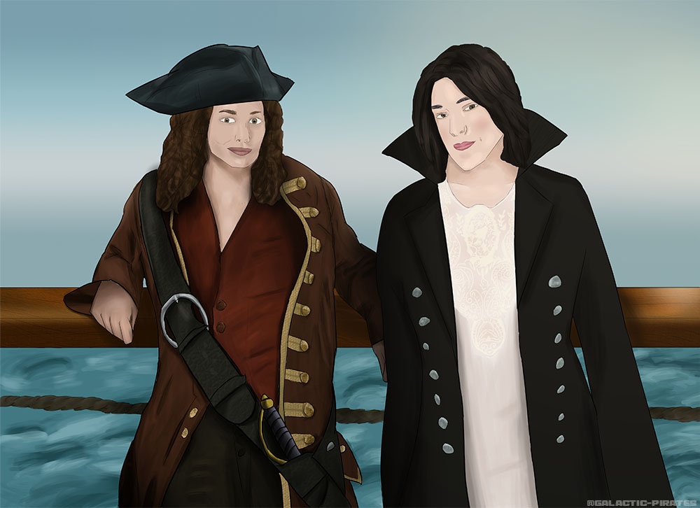
For the Bering and Wells Exchange on tumblr (December 2019) I drew the above picture. It’s funnily enough Bering and Wells in a Pirate!AU. I used a picture of Elizabeth Swann from Pirates of the Carribbean for Myka as a reference and for HG somebody’s fem!Captain Hook cosplay on a mannequin.

As I said in my 2020 introspection/looking forward post I have chosen an art style to try and emulate. I didn’t quite manage it as I still have a long way to go but overall I do think this is the best drawing I have done so far, despite it having been a long time since I last did one. That’s why I have titled this ‘drawing 0’ (something I have admittedly done before) because I do consider this a new starting point.

There are two main points that I wish to learn from this drawing:
1) careful not to overblend. I don’t think I always need to soften it quite so much
2) there is no narrative

I think the overblending issue is something that I’ll only overcome with practice. The lack of narrative though is something I’ll attempt to correct with January’s drawing. I’ve complained for a while that my drawings feel lifeless/emotionless, and partly I think that is lack of facial expression, but I think the bigger issue is lack of movement. In the above drawing they are just standing there as if it was a portrait. Myka’s pose is not so bad (even if I did fail at rendering the wooden railing) but HG is just standing there. It would have been better if she had been leaning towards Myka to tell her a secret, or moving to kiss her, or moving away from her with a wicked look in her eyes. Also I could perhaps consider making better use of props, again to indicate some kind of movement and narrative.

January’s project is yet to be determined but it’s only the third so I have time 🙂

Progress Tracking

I try and find artists to follow so I can learn from them. One thing I’ve noticed is that they do a status report each year, much like I used to do when I was writing a lot. They do like a neat graphic showing everything they drew that year. The boxes are even, rather than the mess above, but then this is covering multiple years.

This is a starting point. I think I wrote a post about “where I begin” some time back as I think it was when I was drawing that picture June 2017 I decided I wanted to actively attempt to improve. So I guess where I am now is less a starting point, and more a point somewhere down the road. I prefer to think of it as a starting point so I can excuse how awful I still am but let’s gloss over that.

Anyway, I’ve done posts about all the pictures in 2018 I think, saying what I think went ok and what was bad, and what I needed to focus on improving next. So I’m not going to say anything, I’m just going to let this timeline speak for itself.

February Art

Well all of my New Years resolutions have gone to shit so far except the “draw every month” thing which on month two is still a thing – yay! 🙂

Right so what was good? what was bad?

I’ve always struggled to pin down my ‘style’ and some of my earlier pieces are quite frankly shocking because I’ve wanted it to look good but just gone crazy with brushes and it’s looked awful. With this I tried to embrace the ‘less is more’ concept, so there’s more a suggestion of shadows on the faces, rather than me trying to shade everything and it looking weird.

HG’s pose is bad. I used references, I tried so hard but it just looks wrong, but I had this image in my head to replicate – this was the kind of composition I wanted and so I did my best with it. I’m much happier with Myka, I’m particularly pleased with her nose. I don’t think she looks very much like herself, for all HG is the poorer drawing, I think she looks more like herself.

I think the hair on both of them is ok. Not great and the more I look at it, the worse it gets. I think the clothing wrinkles on both of them are patchy in terms of quality. The ones on Myka’s back I think are ok, and the ones on HG’s arm aren’t bad either but hampered by the awful pose.

Next time – like always – I need to focus more on getting the basics right to begin with. Smooth fluid lines, put life into the drawing before I add colour. I need to work on my clothing wrinkles as a priority for sure. Materials in general to be honest otherwise I’m never going to be able to draw a car or a spaceship but that’s a whole other conversation.

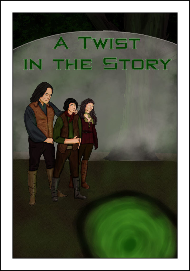
Illustrated Cover for RBB

This is half of my art for the Rumbelle Big Bang.

With this I tried very hard with my lighting. I discovered the lighting panel in Poser and so there are ground shadows and bouncing green light from the portal, and also some definitive shadows from each other I guess which I drew with the lasso tool.

What I learned is that I need greater differentiation on the colours. I did texture Rumple and Bae’s hair but it’s not really visible on screen (it was a lot more visible on my graphics tablet). The same with the tree/foliage in the background above the energy shield. I can see it fine on my graphics tablet but it’s not really visible on my monitor. Some of that is due to the poor colour accuracy on my monitor but greater difference will make it pop more, so it’s still worth bearing in mind.

I need to vary my line weight, particularly looking at the jaw line and maybe the colour of the lines, not sure. I definitely overwork it. It’s a style thing again I guess and there is too much softness for a true comic look. I use the soft painting brush for the shadows and I should probably stick more with the lasso tool, less is more and all that.

So next time try for greater differentiation, less softness, trust my lines more and make less of them.

This is my latest piece. Number #8 I think as it goes. So what did I learn? Oh so many things! Obviously it’s still not great but it’s a learning exercise.

I did this in a mix of Clip Studio Paint and Photoshop, so #1 of things I learned was how to use Clip Studio. I posed the characters in Poser but I had to do the clothes and everything myself, same with the faces.

For what I’m pleased with I think the texture looks good on Belle’s robe and boots. I think the lightsaber blades came out ok and actually at this size Gold’s armor doesn’t look terrible either. I think Belle looks reasonably like Belle, not so sure about Gold, I never can seem to get him :/

Anyway learning! Well first of all composition is a major thing. I started off trying to do a lot of detail and from studying comic books, actually they keep the backgrounds very simple, and usually you can’t see them very much. Everything is often very zoomed in or very zoomed out. This would be more like a cover pose I guess as it’s full body.

I relearned that I really need to start with a good line drawing before trying to move on, I had to redraw parts several times as I tried adding colour much too early. I guess it’s the power of lines – the power of ink because for the comic book style, a lot is achieved with lines rather than with more complex shading.

I did a new thing with the shading. I painted in black with a soft brush for the most part, and then put the soft light filter on. That and the eraser is all I used pretty much, didn’t use the more complicated color-pick/blend brush technique which I think might turn out too soft sometimes. This has some definition to it, which is more appropriate to the style as well I think.

For next time I want to consider the composition better to begin with, and also the light sources, and take my time getting the basics right before diving in.