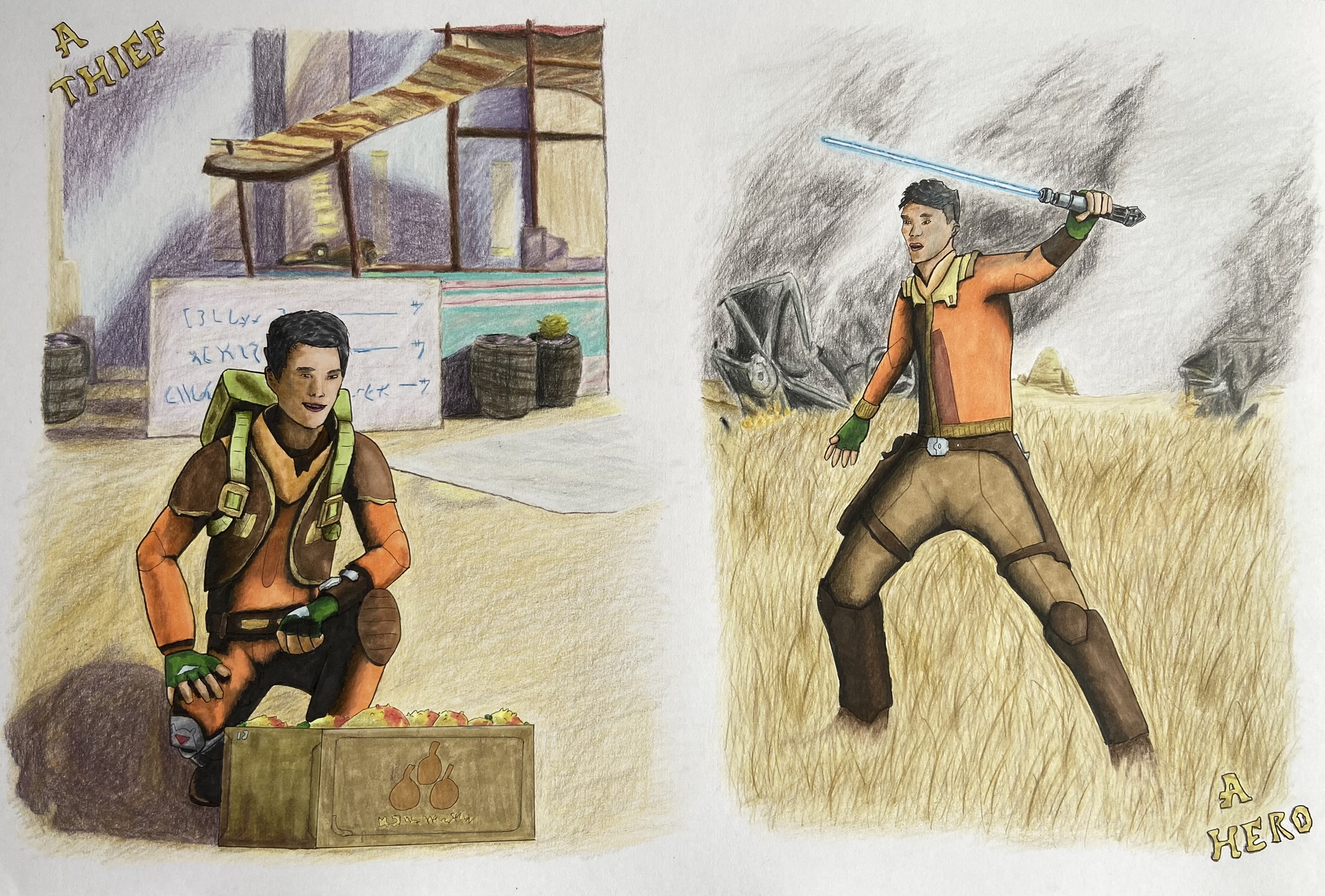
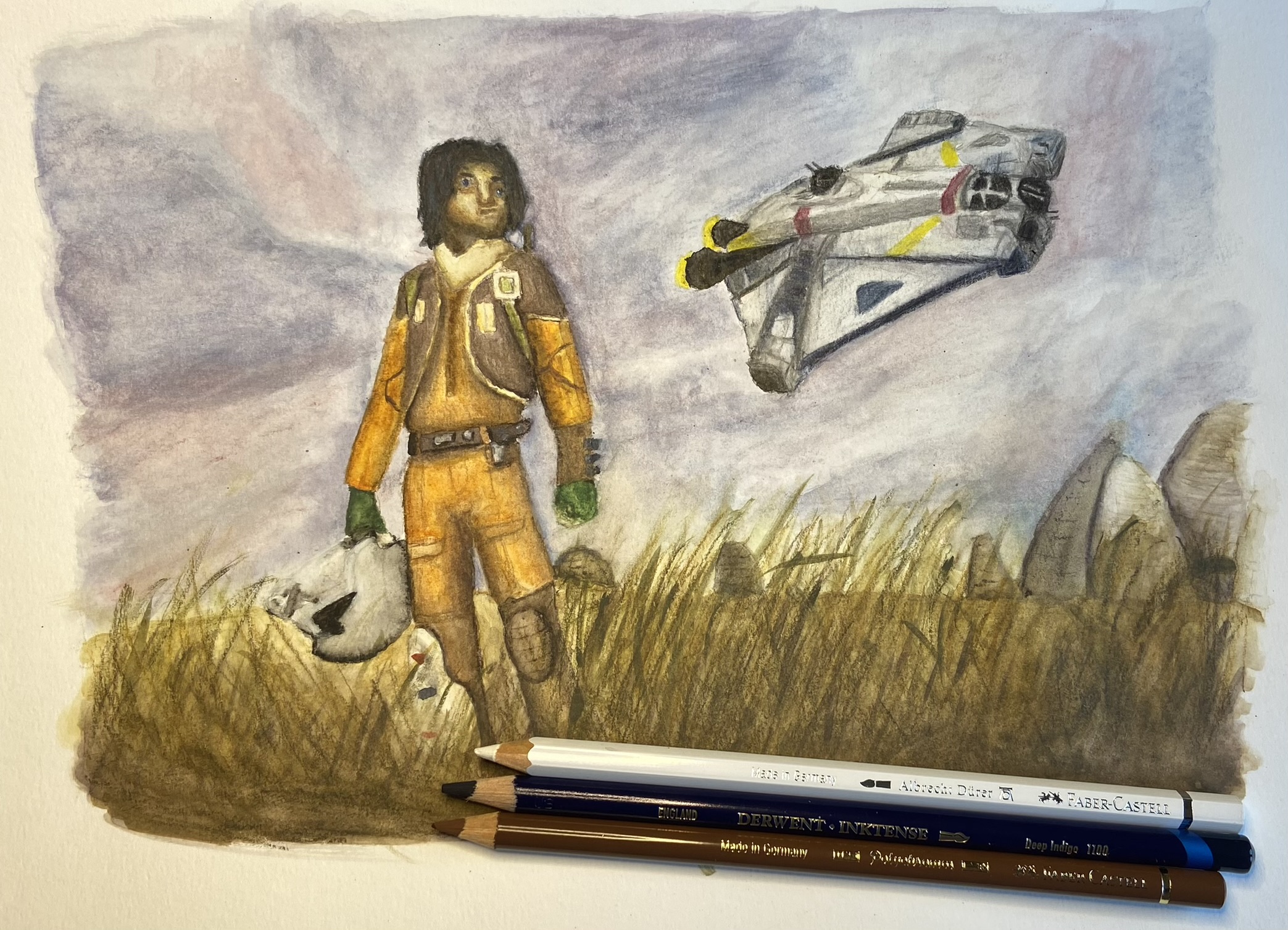
This was inked. I made special effort with the line weights and even did some attempts at ‘comic book style inking’ for the shadows. Ezekiel (as Ezra) was done mostly with markers but some coloured pencil touch-ups. The background was done entirely with coloured pencils. I wanted it to be softer and for Ezekiel to pop more. So the background wasn’t inked, so there were no hard lines and also the saturation of colour was a bit less as the markers are stronger.
I’m relatively pleased with the composition. I think the one on the right (in the field) came out the best. I like the background on that. I think the grass field rendered well and I blended his feet in nicely. The smoke isn’t that good but it’s not terrible either. However, the background at the market went a bit wrong. I got a bit lost doing the stall. Also I’m sure I messed up the perspective on the box and probably elsewhere too.
The shadows on the market picture are the worst. The ones in the background are just bad really. I made an effort but it’s not good. The comic inking shadows on both didn’t come out that well either. I think perhaps I did it wrong. It didn’t blend in and look right. It was definitely too intense on Ezekiel’s side in the field picture.
I still feel like there isn’t much life in the pose. It’s very stiff. I suspect that’s to do with my linework. It’s not very fluid as I’m careful in copying my mocked up ‘sketch’. I still have a lot to learn.
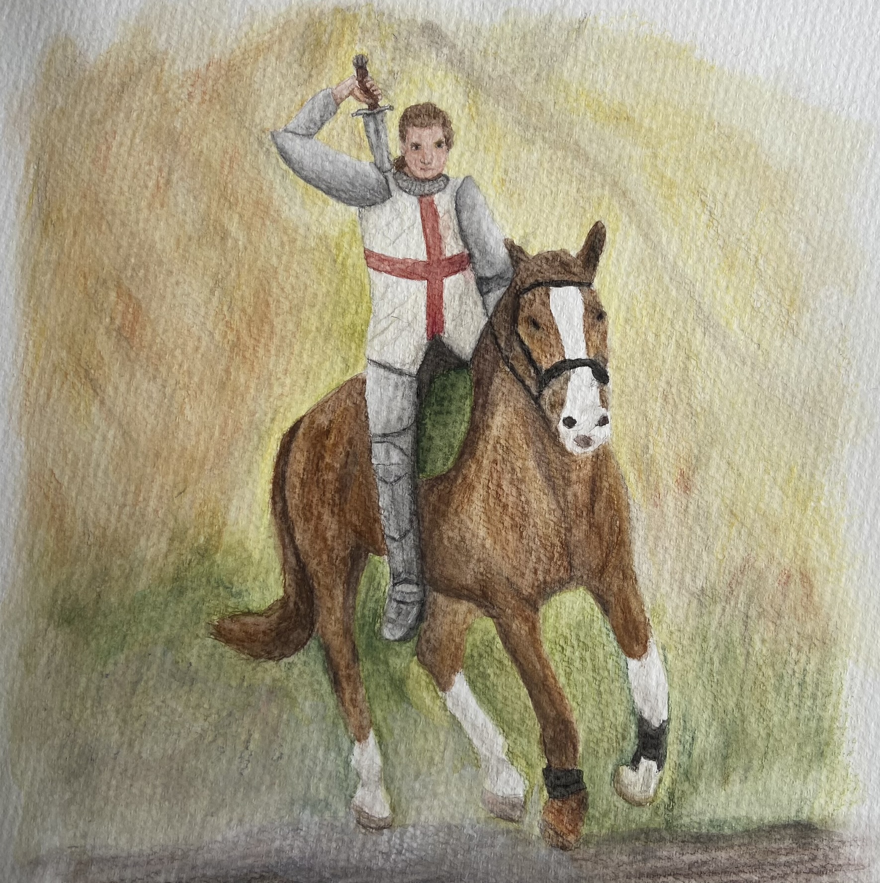
Watercolour pencil painting of Galahad, in Camelot times.
I had a reference for the horse and the background. It was the rider/knight and the pose with the sword that I changed. My reference was blurry which I think didn’t really help. I wanted a somewhat blurry, fantasy background. Sort of like he’s riding and that’s why the details can’t really be seen. However, I don’t feel like I achieved that. I think it’s just a mess of colour, and the ‘glaze’ I tried to add at the bottom for the dust the horse was kicking up didn’t work at all.
I can see far more of the paper texture than I am comfortable with. I don’t know if that means I didn’t use enough pigment or if it’s just this paper. It’s a new watercolour pad and I think it’s cold-press (I usually use hot-press which is smoother).
He looks rather stiff and unnatural and his torso isn’t correct. I don’t know if that’s in the shaping or in the shadows meaning it doesn’t look like it has form. I definitely think I need to lay more pigment down, and possibly use less water. I’m still learning the balance.
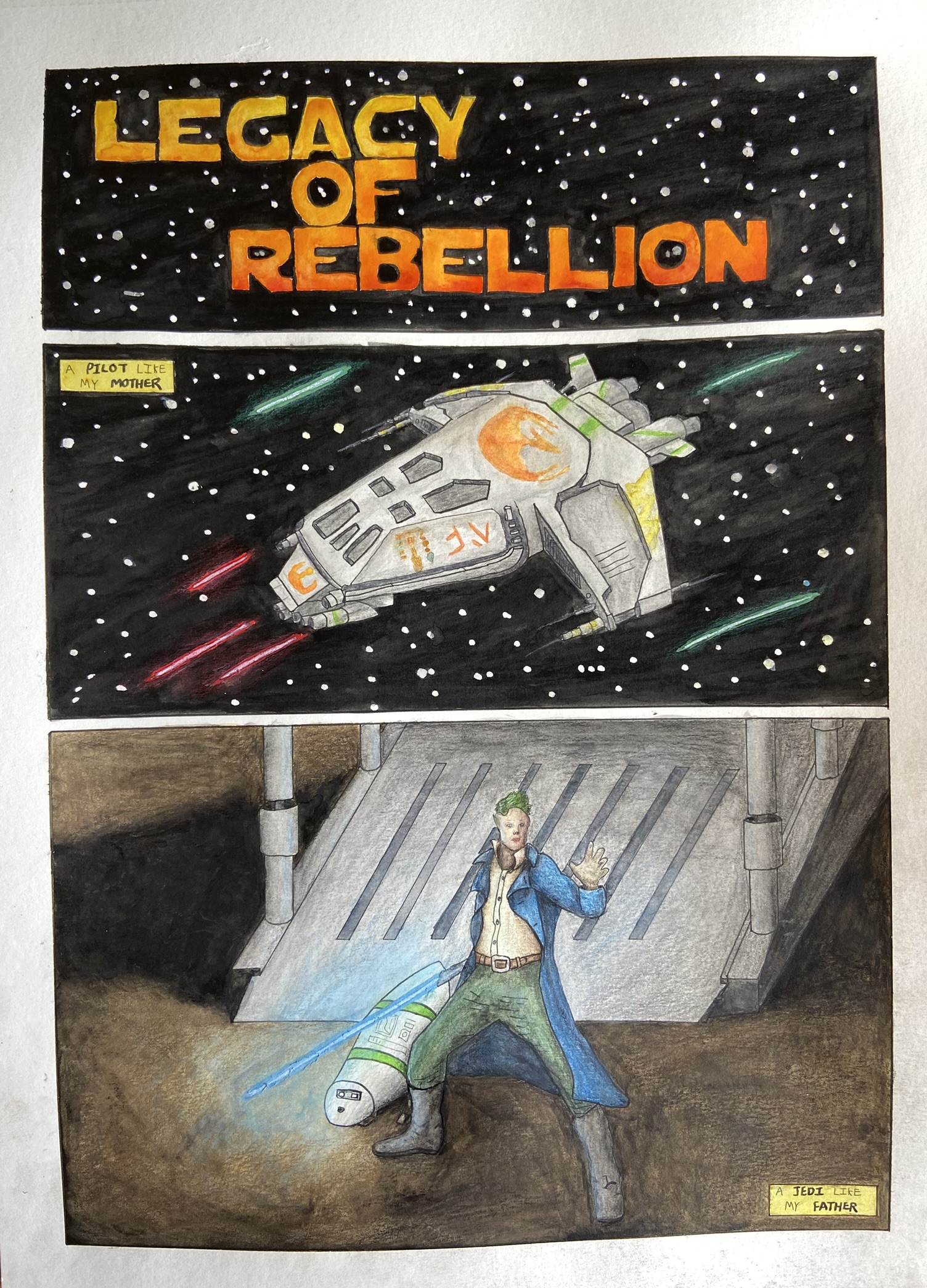
Watercolour painting with a some coloured pencil corrective work.
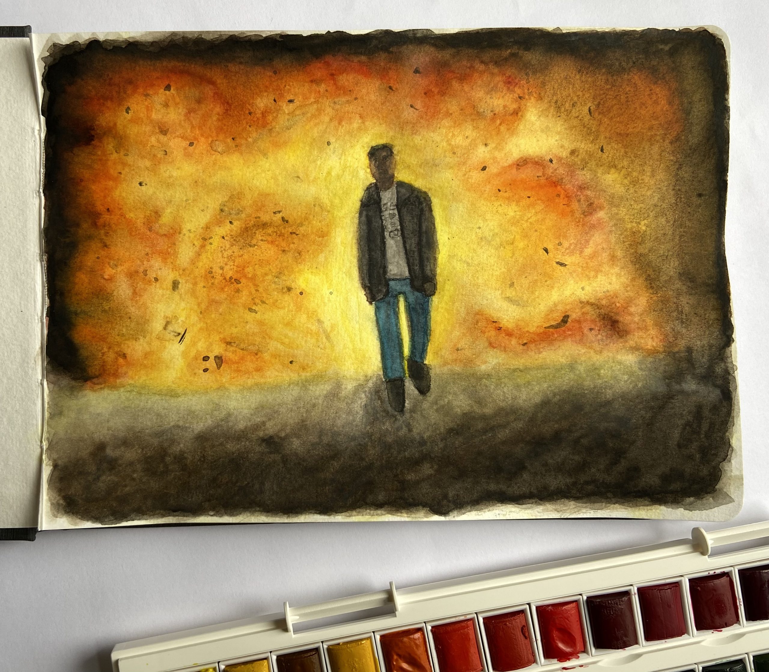
Attempt at a comic book style three panel strip. I like how the title painted and the bolts in space look alright. I sketched this with the grid method from the digital mock-up, rather than printing and tracing, and I’m pleased I made the attempt. I think the ship turned out ok. Not great but my reference was shaky and so the rendering of the ‘windows’ was pure guesswork. I’m pleased I tried to deepen the shadows at the bottom, there was an effort at contrast there at least.
However, the dramatic lighting I was going for (night scene, with the lightsaber glowing) did not work out. The lightsaber glow wasn’t enough. An attempt was made but executed badly. I didn’t get the shadows right. I can see now how I messed up with his leg, and lack of defined shadows there etc. Also in my effort not to overblend, I didn’t put enough contrast in several places, most notably the droid and Jacen’s face, but also his clothes. Another big mess up was with the stars. I used masking fluid to keep those areas white and they are too big and uniform.
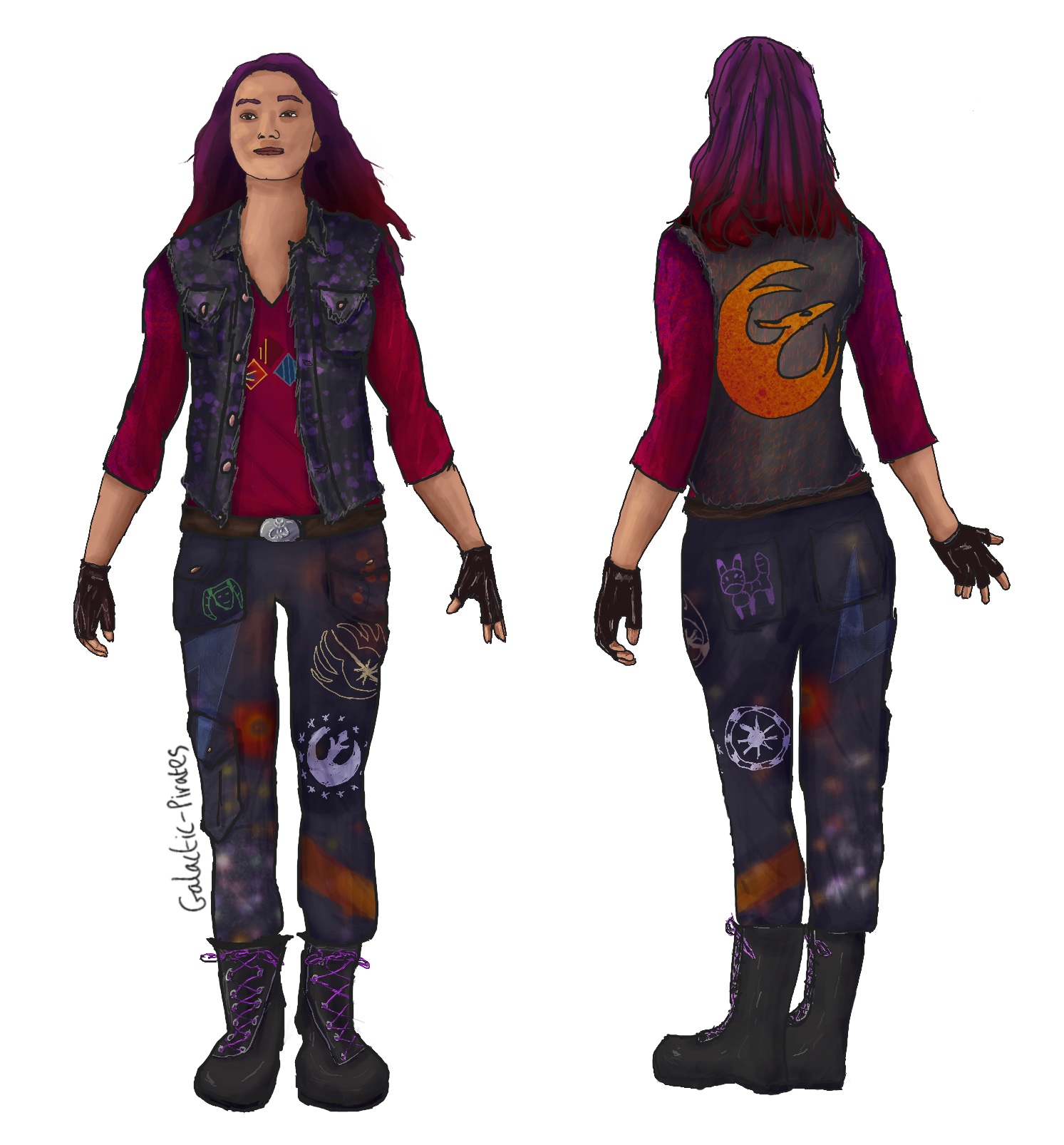
A couple of days ago I saw a screenshot of Sabine from the Ahsoka trailer. She wasn’t in armour, just a plain shirt and jeans. I posted about how I didn’t vibe with that outfit, that it was too bland for her. That it didn’t speak to her personality in my opinion. So I decided to have a stab at coming up with an alternative.
So about the outfit!
The symbols on the t-shirt came from the jacket from a different scene in the trailer.
The engraving on the belt buckle is the Mythosaur, symbol of Mandolore.
Obviously the Phoenix on the back of the vest is Sabine’s emblem for the squadron.
I thought she should have a lot of pockets for her art stuff (spray cans, brushes etc.) so there’s the vest and then the cargo trousers. Utilitarian and comfortable.
She strikes me as someone very practical and badass. Hence the combat boots even when ‘off-duty’ but jazzed up with purple laces for her personality. Same with the fingerless gloves.
Her armour had some patterns. Mostly geometric and a lot of just colour splashes. So I tried to replicate that by giving the t-shirt like a spray effect so it’s mostly red with some purple at the top (echoing her hair).
For the trousers I took inspiration from images of “graffiti style” trousers. I tried to imagine what artwork Sabine would pick and so there’s the Loth Cat, symbol of the Jedi, Republic and New Republic. A representation of her favourite handheld explosive, some paint splatters, a geometric lightning bolt like she put on Ezra’s stormtrooper helmet and then a little doodle of Hera just because.
Drawn in Procreate, with thanks to PoseMuse for the shortcut.
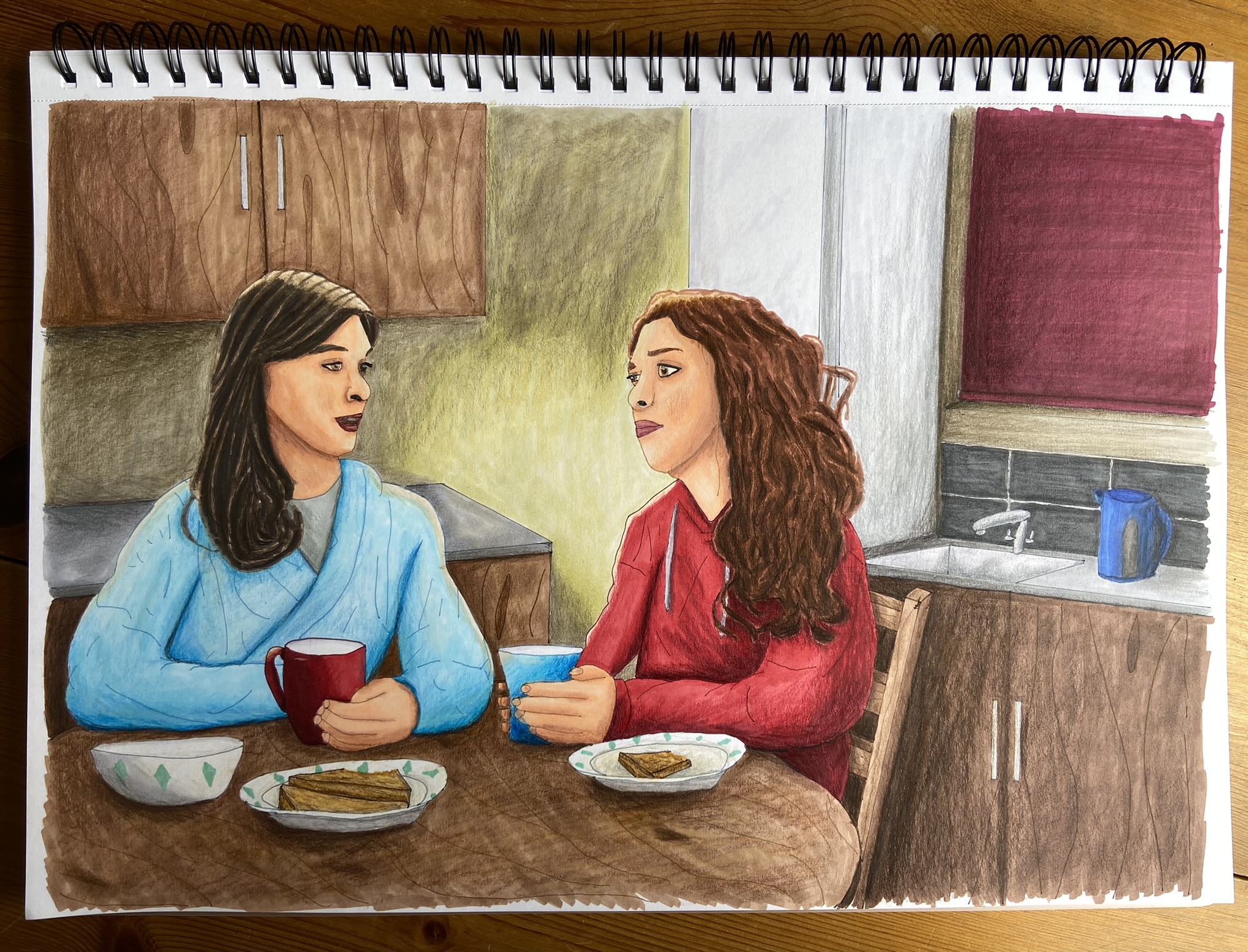
Illustration with markers and coloured pencils, for the Bering and Wells Big Bang event.
I experimented a bit with the lighting having the line for the highlights. I also tried to copy the “Marvel’s What If?” style a bit with the inking colours. I’m relatively pleased with the composition and the skin colour is better than my last attempt with markers thank merlin.
It’s not terrible but the markers on the large background areas went streaky as I think my technique wasn’t very good. The coloured pencils didn’t blend as well as I had hoped and the shadows look weird.
Still considering I usually overwork/overblend everything to death, there was a concerted attempt at a more comic book style here. Not executed well, but attempted, and that’s a start.
The January blog topic for WriYe is quite open to interpretation I feel. The prompt is:
“(Re)starting fresh, for a new year, new story or after a writing break.”
Now I am both late to this topic and perfectly on time. You see the new year is a boundary time, it’s where you can put the past in the rear-view and ‘start again’. Obviously you can do that at anytime but with the turn of a calendar, and potentially millions of other people doing the same thing, there is a certain weight to it. If 2022 didn’t go well, then that’s ok because 2023 is a fresh start! That kind of thinking.
I struggle with boundary times as they make me reflective. I get torn between the hope of the possibility that maybe the future will be better/different, and being depressed and hopeless over how the past hasn’t been what I wanted, and that another year has gone by and I’m still no closer to my dreams etc. So I guess essentially what I’m saying is the whole “new year, new start” thing is something I feel very keenly. If life is about chances, then I guess psychologically speaking a new year does feel like a new chance. Every year when I do my retrospective and then my plan, I say that I want the upcoming year to be different.
I said in the WriYe year in review I would do a post for art. Not very creatively titling but I think it actually proves a point – the art is important to me.
I didn’t write a post about art plans specifically until the end of October. It’s been an ‘impossible year’ with moving and not really knowing what I was doing. I had sort of mentally thought “oh a drawing a month” as a general goal as I have done for the past several years, but hadn’t gone much beyond that. I had the Coloured Pencil Academy course to complete and then this past summer I did get a bunch more courses on Udemy which I haven’t done.
So end of October and I had plans. I basically said that I wanted to ‘get serious’ and commit 3 hours 6 days a week to working through the courses. I had benched art during October as I had a lot of writing courses to comb through in addition to prepping for NaNo. However, I had this idea that I could draft for NaNo in the morning and do art in the afternoons.
It didn’t happen once. Not once. I didn’t do any art during November at all.
Then December and I decided to use some new supplies I got during Black Friday to make a couple of christmas presents. I had to practice using them first of course, and so December I spent totally on art – no writing at all. Not one single word.
Which really is a problem. I’ve been thinking about that, musing on it really, over the past week and I’ve sort of come round to the conclusion that I want to treat writing as a job. I want writing to be my job. Yes it’s a dream at this point but if I put in the work then maybe, just maybe, it could be reality. However, the art has increased in importance to me. In the beginning I wanted to illustrate my stories. Then I thought about making my own book covers. Then I got mega-depressed because of AI in art (hence the Black Friday art supplies), as I thought maybe if I went traditional then that might escape AI for a little longer.
I just want to be good at things. I want to be good enough. I don’t feel like I ever will be, with writing or with art, and so it’s a constant crisis of faith everyday. I try and persist even as I ask why. I have dreams, of art supplementing writing – two careers in a sense. Which is perhaps why I am struggling to balance them as I want to work both of them full time, but I am incapable of doing anything full time due to my disability.
Anyway this is what I did this year:
The top three are exercises from the Coloured Pencil Academy.
The next two are colouring pages that served as practice with markers, and watercolour pencils, respectively. The stargate art was a total mixed media project. The cars was a christmas present done in markers and coloured pencil. The landscape was a christmas present done with watercolour pencils and coloured pencil. Finally there is a digital drawing of Seven and Raffi from Star Trek: Picard.
I did the three exercises and the digital drawing in April. Everything else I did this month in December. So consistency was not really a thing this year.
I think about the best thing I can say is that I tried. I didn’t forget that I wanted to do art, I just struggled and didn’t do it most of the time. I’m still a very long way from where I would like to be.
Anyway I am going to end this post with the same thing I put at the end of the WriYe retrospective – now I just need to work out how to build on this and move forward in 2023.
This is December’s blog topic but honestly it’s something I would do anyway. Retrospectives are a bit of a thing for me. The prompt is simply to “sum up your year” so I will endeavour to break it down and not just ramble.
I started that goal post by saying that in my review of 2021 I had put “that I really didn’t want to get to the end of the year and be disappointed again – but I was.” and that is the dream. Ultimately really that was the dream for this year when I get right down to it. What I said in that goal post was that I was really searching for some confidence, to have some hope again, to feel like I can actually do it.
It was one of the reasons why I wanted a PS5 (they have since released the games on PC but hadn’t back then). I saw an advert and was instantly hooked. I have a love affair for ‘archaeological treasure hunts’ when it comes to movies. Books have been a bit hit and miss (I think I might need to write my own to have something I truly love). A lot of the same issues plague the movies but I guess the visual bonanza makes it easier to ignore. I got the Tomb Raider game for free on the PC and I didn’t overly enjoy that (I found it frustrating for some reason but can’t recall why now). Anyway quite why I thought I would really like the Uncharted games I don’t know. But I asked for the remastered ‘Nathan Drake collection’ (aka the first 3 games) AND the remastered ‘Legacy of Thieves’ collection. I got the entire set having not played a single minute.
Fortunately I did really enjoy the games. I have completed the campaigns on 1 & 2 and have almost finished 3. I am not that good at it so I don’t think I’ll ever be able to get all the trophies but I will go back and try and get some of them. It’s a bit annoying that the trophies require all the difficultly modes (I like normal/easy ok, don’t judge).
Anyway! That’s the game and this post is about the movie. I’m just saying the perspective that I came to the movie with. Someone that loves the genre, has played the games (well half of them) and put the movie on my “must watchlist” the second I heard it was a thing post-getting the games.